import pandas as pd
import matplotlib.pyplot as plt
Introduction
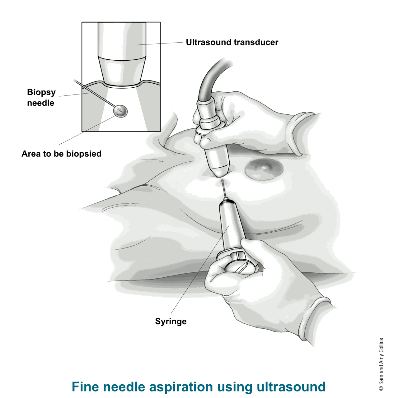
The objective of this small project is to train a model to predict whether a breast lesion is malignant or benign, from data obtained by biopsies.
The data comes from the University of Wisconsin. It consists of features from digitized images of fine needle aspirates of a breast mass.
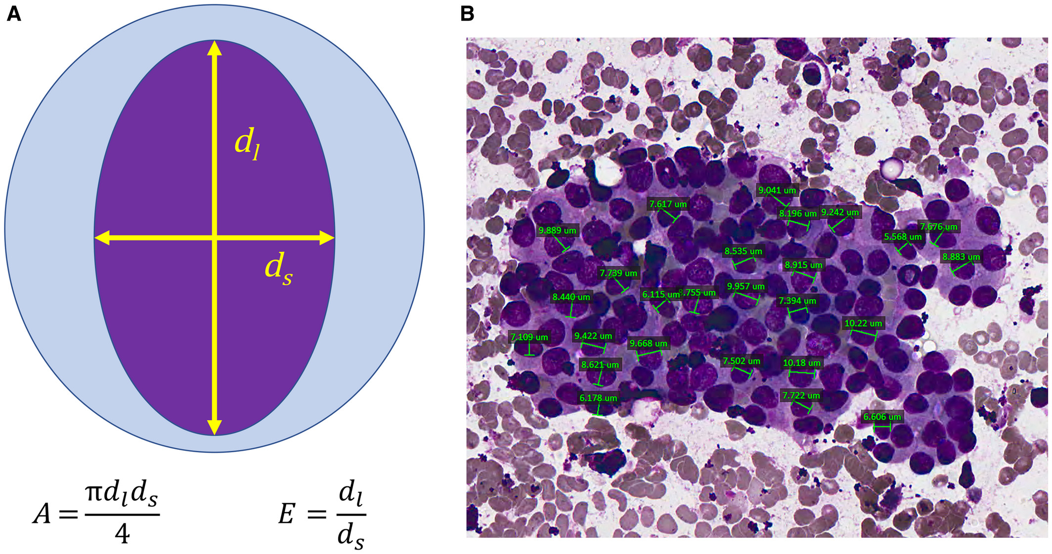
The features describe characteristics of the cell nuclei present in the image. Namely, ten real-valued features are computed for each cell nucleus in the digital image:
1) radius (mean of distances from center to points on the perimeter)
2) texture (standard deviation of gray-scale values)
3) perimeter
4) area
5) smoothness (local variation in radius lengths)
6) compactness (perimeter^2 / area - 1.0)
7) concavity (severity of concave portions of the contour)
8) concave points (number of concave portions of the contour)
9) symmetry
10) fractal dimension
(picture from Chain, K., Legesse, T., Heath, J.E. and Staats, P.N. (2019), Digital image‐assisted quantitative nuclear analysis improves diagnostic accuracy of thyroid fine‐needle aspiration cytology. Cancer Cytopathology, 127: 501-513. doi:10.1002/cncy.22120)
The mean value, standard error and and "worst" or largest (mean of the three largest values) of these features were computed for each image, resulting in 30 features per instance (patient). The first and two columns correspond to the patient IDs and the diagnosis outcome (M=malignant, B=benign).
You can find more information and other data sets at this link.
Load data
Using the function pd.read_csv load the data set with no header
url_data = "https://archive.ics.uci.edu/ml/machine-learning-databases/breast-cancer-wisconsin/wdbc.data"
Using the method head() of a dataframe, display the first 5 lines of the data
How many patients are present in the data set?
Change the name of the columns of the df so that they match the features. Use the columns attribute of a df
features_names = [
    'radius',
    'texture',
    'perimeter',
    'area',
    'smoothness',
    'compactness',
    'concavity',
    'concave_points',
    'symmetry',
    'fractal_dimension'
]
features_names_SE = [feature+'_SE' for feature in features_names]
features_names_W  = [feature+'_W' for feature in features_names]
column_names = ['ID', 'diagnosis']+features_names+features_names_SE+features_names_W
df.columns = column_names
Drop the 'ID' column (function drop()), as well as the columns with standard errors and worst values of the parameters.
Check if there are any missing values. To do so, first define a function num_missing() that takes a Series (=a column) and returns the number of missing values in it (use pd.isna()). Then use the apply() method to apply this function to each column of df
Check the types of every column (dtypes attribute)
What is the type of the entries of the 'diagnosis' column?
Data exploration
How many patients have a benign lesion and how many have a malignant tumor? What are the corresponding percentages?
Using the method value_counts() and the Series method plot(kind='bar'), visualize these numbers as bars
Using the swarmplot() function of the seaborn package, plot swarmplots comparing radius, area and concavity between bening and malignant
Use a for loop over the features_names and plot the histograms of each feature, with one histogram for the benign lesions and one histogram for the malignant tumors (both histograms on same figure, colors red and green). Use transparency (parameter alpha=0.5) when plotting histogram (method .hist()
Same with kernel density estimate (kde) plots (method .plot.kde() or function sns.kde())
Using the sns.pairplot() function from seaborn, with palette=('r','g') and hue='diagnosis' to plot benign and malignant in different colors, plot all 2x2 plots of features against each other
Do you observe correlations? Do they make sense?
Use the .corr() method to compute the correlation matrix of the data. Use the plt.matshow() function (a pretty cmap is plt.cm.Blues) to display it. Use the plt.xticks(, rotation='vertical') and plt.yticks() functions if you want to display names of features
Preparation of the data
Define X as containing only the features and y containing only the outcome (diagnosis)
Split the data set into a training (X_train and y_train) and a test set (X_test and y_test). Put 30% of the data in the test set. Use the train_test_split() function from sklearn
Look at the variances of the features
There is a wide heteregeneity of values. This suggests to rescale the data, i.e. subtracting mean and dividing by standard deviation. Do this using the StandardScaler() function from sklearn.preprocessing. Apply the same scaler to X_train and X_test
Fit model
Fit a random forest classifier to the data with max_depth = 5
Compute predictions on the test set (.predict() method)
Compute the accuracy
Compute the confusion matrix of the prediction
Print the classification report from sklearn.metrics to print other metrics
Note: sensitivity corresponds to the recall in what is defined as the positive class (say, malignant here) and specificity to the recall in what is defined as the negative class (say, benign). Likewise, precisions correspond to positive and predictive values
Map the benign entries to 0 and malignant to 1
y_test_01 = y_test.map({'B':0, 'M':1})
Using the probability predictions (of the malignant class) of the random forest classifier as scores, plot the ROC curve and compute AUC. NB: you can obtain the order used for the classes using the attribute classes_ of the classifier
Using the attribute feature_importances_ return the list of features ranked by order of importance in the model
Plot their relative importances as a barplot with all features
Cross-validation
To evaluate the performances of the model not only on one test-set but on multiple ones, we can use cross-validation. Let's use 10 folds. This means that the data set will be cut ten times into a learning and a test set and each time we will train a random forest classifier.
Use the function cross_validate from sklearn.model_selection to perform the 10-folds cross-validation. Map the y_train data to 0 and 1 before. Select the roc_auc and accuracy as metrics to be computed.
Compute the mean AUC and mean accuracy